Branding & Styling
Craft a distinctive look and feel for your Theneo documentation with extensive branding and styling customization options. From choosing the right color palette to setting a custom domain, Theneo empowers you to align your documentation with your brand identity.

Key customization features
- Light and Dark Mode Customization: Tailor your documentation's appearance for both light and dark mode preferences with dedicated logos and color schemes, ensuring a consistent user experience in any setting.
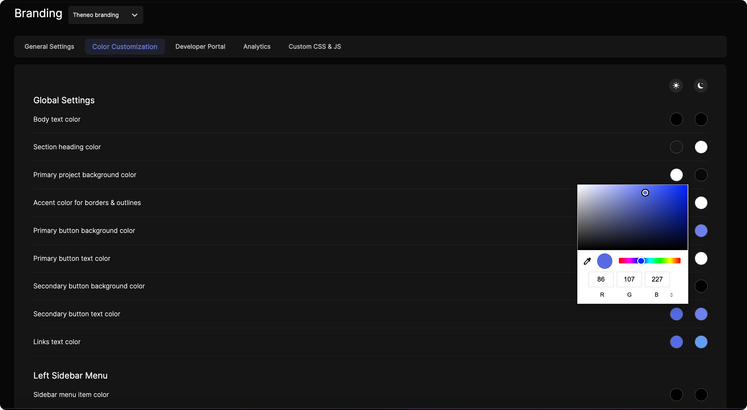
- Color Customization: Fine-tune the color of text, buttons, backgrounds, and more with an easy-to-use color picker. Double-click to access HEX codes for precise matching to your brand colors.
- Custom CSS and JavaScript: For advanced customization, inject custom CSS and JavaScript to take full control over the look and functionality of your documentation.
- Custom Domains: Strengthen your brand's online presence by hosting your documentation on a custom domain, creating a seamless transition from your main website to your Theneo-hosted content.
With Theneo's customization tools, you can create documentation that not only serves its purpose but also resonates with your brand's aesthetic and ethos, making every interaction with your API an extension of your brand experience.
General Settings
- Logos: Upload separate logos for light and dark modes, ensuring clear visibility regardless of theme. Ideal dimensions are provided for optimal display.
- Favicon: Customize the small icon that appears in browser tabs and bookmarks to make your site easily identifiable.
- Logo Hyperlink: Direct users to your desired URL through the logo in your documentation.
- Attribution: Toggle the "Powered by Theneo" attribution on or off to match your branding preferences.
- Document Font: Select from a variety of fonts to maintain consistency across your documentation.
Color Customization of the published view projects:
Color customization is available on Business and Growth plans.
Global Settings:
Global Settings:
- Body Text: Determine the color of the main text for readability against the background.
- Section Headings: Highlight section titles with distinct colors for better navigation.
- Background: Choose a primary color for the project's backdrop.
- Accents: Accentuate borders and outlines with a complementary color.
- Buttons: Set the background and text colors for buttons to align with your brand.
- Links: Define the color of hyperlink texts to make them noticeable or integrated.
Left Sidebar Menu:
Left Sidebar Menu:
- Item Colors: Manage the colors of individual items and the active selection to enhance the sidebar's functionality and aesthetics.
- Background: Select a primary background color for the sidebar for a unified look.
Content Cards:
Content Cards:
- Code Snippets: Customize header and body background colors for code snippet cards for clarity.
- Base URL: Adjust the color scheme of the Base URL card headers and bodies.
- General Info: Set the header and body background colors for general information cards.
Feedback and Text Selection:
Feedback and Text Selection:
- Feedback Button: Ensure your feedback button stands out or matches your design with customizable colors.
- Text Selection: Personalize the background and font colors of text selections to reflect your brand.
API Explorer Buttons and Response Boxes:
API Explorer Buttons and Response Boxes:
- Buttons: Choose colors for your API Explorer buttons that prompt users to interact.
- Response Boxes: Assign colors to property and value texts in response boxes for distinct visibility.
Alerts:
Alerts:
Customize background, icon, text, and border colors for warning, primary, danger, and success panels, ensuring that each alert type is distinct and noticeable.
Each of these elements can be adjusted for both light and dark modes, maintaining consistency or providing contrast as per your branding guidelines.
Tip for HEX Codes: To quickly use your brand's HEX color codes, simply double-click on the RGB section within the color picker to switch to HSL, where the HEX code input will appear. This allows you to paste your HEX codes directly for precise color matching.
Custom CSS & Javascript
Custom CSS and JS are available on Growth plan.
Custom CSS and JavaScript are powerful tools for personalizing and enhancing the functionality of your Theneo documentation. This guide will walk you through the process of implementing custom CSS and JS to tailor the look and feel of your project.
1
Step 1: Access Custom CSS and JS Settings
Navigate to the 'Branding' section in your Theneo dashboard. Within the Branding menu, you will find a tab or section labeled 'Custom CSS & JS.' This is where you can add your code snippets.
2
Step 2: Write or Paste Your Custom CSS
In the Custom CSS field, you can write your own CSS rules or paste existing snippets. This can include styles for:
- Custom fonts and text styles
- Overriding default padding and margins
- Background images or gradients
- Custom animations or transitions
- Responsive adjustments beyond the standard layout
Ensure that your CSS is properly formatted and does not contain any syntax errors to avoid any display issues.
3
Step 3: Write or Paste Your Custom JavaScript
The Custom JS field is where you can add JavaScript to your documentation. Common uses for Custom JS include:
- Implementing third-party scripts such as analytics or live chat support
- Custom interactions or behaviors for buttons and links
- Dynamic content loading or page manipulation
- Form validation and submission handling
Make sure your JavaScript is well-tested to prevent any conflicts with Theneo's existing scripts.
4
Step 4: Save Your Changes
After adding your custom CSS or JS, click on the 'Save' button to apply the changes. It's important to review your changes to ensure that they produce the desired effect without interfering with the user experience or functionality.
Custom Font
Customizing fonts in your documentation is an excellent way to enhance branding and readability. This guide will walk you through the steps to add a custom font to your documentation using the Custom CSS feature.
1
Step 1: Select a Font
- Choose a font:
- Visit Google Fonts or any other trusted font source.
- Browse and select the font that fits your style.
- Alternatively, you can use a Base64-encoded font if you have one, which allows embedding fonts directly without external links.
2
Step 2: Add the Font to Your CSS
Create the necessary CSS code to apply the font to your documentation. Below is an example:
In this example:
- The
@importrule links to the custom font's source. - The
font-familyproperty applies the chosen font to all text in your documentation (*is the universal selector).
 @import url('https://fonts.googleapis.com/css2?family=Roboto:ital,wght@0,100;0,300;0,400;0,500;0,700;0,900;1,100;1,300;1,400;1,500;1,700;1,900&family=Sofia&display=swap');

 * {
     font-family: "Sofia", serif;
     font-weight: 400;
     font-style: normal;
 }
3
Step 3: Update Your Documentation
- Open Theneo Dashboard and navigate to Branding Configuration
- Locate the Custom CSS section.
- Paste the CSS code from Step 2 into the provided field.
- Save the changes.
Branding Template Selector
The Branding Template Selector lets workspace Admins and Editors apply a complete visual identity to their documentation portal in a single click. Instead of configuring colors, CSS, and JavaScript individually, you choose one of three predefined templates — Solid, Bloom, or Roboto — and all branding fields are populated automatically across your entire workspace.
Who Can Use This Feature
Workspace Admin
Full access to the Branding General Settings page. Can select, apply, and override any template, and may further customize individual branding fields after applying.
Workspace Editor
Can select and apply branding templates from the General Settings page. Changes apply workspace-wide in the same way as Admin-applied templates.
Viewers and project-level collaborators cannot access Branding General Settings and will not see the Template Selector.
Available Templates
Each template ships with a complete set of branding values — primary and background colors, custom CSS, and custom JS. Selecting a template overwrites any previously configured values in all three fields.
What gets applied:
— Primary and accent color palette with solid, opaque fills
— CSS reset and layout rules for dense, structured pages
— Minimal custom JS for navigation state management
Solid
What gets applied:
— Pastel-toned color palette with gradient overlays
— CSS for card softness, rounded radii, and elevated surfaces
— Custom JS for smooth scroll and animated section transitions
Bloom
What gets applied:
— Teal/emerald base palette with configurable accent
— CSS scoped around Roboto font loading, line height, and spacing scale
— Lightweight custom JS for code block copy and sidebar state
Roboto
What a Template Populates
Applying any template automatically fills the following branding fields. Fields you have previously configured will be overwritten.
Color palette (primary, background, accent) | Workspace-wide | Yes |
Custom CSS | Workspace-wide | Yes |
Custom JavaScript | Workspace-wide | Yes |
How to Apply a Template
1
Open Branding General Settings
Settings → Branding → General
2
Preview the available templates
Solid
Bloom
Roboto
3
Select your template
Click the template you want to apply. A confirmation prompt will appear summarizing which branding fields will be overwritten.
If you have existing custom CSS or JS, the prompt will explicitly list these fields. Review carefully before confirming — this action cannot be undone automatically, though you can reapply a different template or restore values from history.
4
Confirm and apply
Apply Template
5
Fine-tune if needed
Settings → Branding → General
Switching Templates
You can switch between templates at any time. Each new template selection fully overwrites the current branding configuration, including any manual edits made after your previous template was applied.
Branding History & Version Revert
The History tab in Branding settings gives workspace Admins and Editors a chronological audit log of every branding change made across the workspace - who made it, when it was saved, and the ability to roll back to any of the three most recent versions instantly.
Accessing Branding History
Navigate to Settings → Branding → History. The History tab sits alongside the General tab on the Branding settings page and is visible to all Admins and Editors in the workspace.
Viewers and project-level collaborators cannot access the Branding settings page and will not see the History tab.
Revert Eligibility
Not every log entry can be reverted. The revert action is available on the three most recent branding versions only.
Revert is workspace-wide and immediate.
How to Revert a Branding Version
1
Open the History tab
Settings → Branding → History
2
Identify the version to restore
Review the log entries. Each of the three most recent versions shows the workspace member who saved it and the exact timestamp. Use this to confirm which state you want to restore.
3
Click Revert
Revert
4
Confirm the revert
Confirm Revert
On this page
- Branding & Styling